


Screenshots: the first impression your game makes before someone even watches a trailer. They’re like a dating profile picture - get them right, and people swipe right (or, you know, add to cart). Get them wrong, and they assume your game is a low-budget fever dream. So, how do you craft screenshots that don’t just look cool but actually help sell your game?
Well, I’ve been analysing screenshots for a few years now. From games I’ve worked on, to competitors and industry best practices. I’ve analysed years’ worth of performance data as well as read several AI analyses to try to figure out what makes not only a good screenshot but one that actually converts to sales.
During this time I’ve discovered four key elements all the best screenshots have in common.
Let’s break it down.
1. Quality: Your Game, But Hotter
This should be obvious, but let’s say it anyway - your screenshots need to look good. Not "okay," not "fine," but chef’s kiss levels of polished.
It’s a fine line though, back to the dating app example, swipers or in this case game shoppers want to see quality, but don’t want to see anything that would make them think this is fake.
It’s all the stuff you know and hate from dating apps (or have been warned about vicariously by your friends). Be careful if all the pics are from the same angle, they are all a little out of focus, or there are a ton of filters on.
Whether dating app profile pic or store page screenshot you want to put your product in the best light (literally and figuratively) without resorting to obvious cheats.

Here’s how to avoid visual crimes:
Max out those settings – No one’s impressed by a game running on 1998’s potato mode. Crank up the resolution, max out the shadows, and throw in some tasteful anti-aliasing.
Use proper composition – The rule of thirds exists for a reason. If your character is dead-center in every shot like a confused school portrait, it’s time to get creative.
No UI clutter – Unless your UI is a selling point, hide it. No one wants to see 47 overlapping quest markers.
No awkward bugs – That perfect action shot doesn’t matter if an NPC is t-posing in the background like an ancient deity. (THIS ONE IS ESPECIALLY TRUE IN YOUR DATING PROFILE PICS)
2. Meeting Player Expectations: Sell What You’re Actually Selling
Ok now that we’ve got the obvious one out the way let’s look at something that’s potentially a bit more difficult to grasp - customer expectation.
Ever ordered food based on a picture, only for it to look like a sad imitation when it arrives? That’s what happens when your screenshots overpromise and underdeliver.

Sometimes it’s not even about overpromising, it’s just that you aren’t showing shoppers what they expect to see.
Match your gameplay – If your game is a strategic, slow-burn RPG, don’t make it look like an Apex Legends highlight reel. Players will be confused
Be honest about graphics – If your game isn’t running on the latest Unreal Engine magic, don’t doctor your images into looking like a tech demo.
Show core mechanics – What’s your game actually about? If it’s base-building, show an awesome, thriving base. If it’s combat, capture a moment of pure adrenaline.
If we look at the screenshot below from Baldur’s Gate III, we might think that it’s not a great idea to show the game with all the UI elements in place as I’ve already mentioned above. BUT (I like big buts I cannot lie) in this particular case, when it comes to turn-based RPG’s like Baldur’s Gate III, the UI is actually one of the most important factors of the game and something the developers want to showcase. The key is understanding your audience, what are they going to want to see and what information do they need to make an educated purchase decision.

It’s not all good examples. Embarrassingly enough Diablo IV has some of the poorest screenshots on Steam. This is the first screenshot.

While it certainly is high quality in terms of lighting. There really is nothing much else going for it. It isn’t exciting, the composition is lacklustre and a bunch of other missing elements that I won’t go into now as it will spoil the next few paragraphs, all this really does is show you some new cosmetics and as a consumer, if that’s the first thing you show me, my expectation is that cosmetics and microtransactions are a big part of this game (duh!).
This is the next screenshot - needless to say, it’s pretty bad.

3. Tell the Story of Your Game (Your USPs, But in Picture Form)
The third point is very closely linked to number two in that players have expectations they want met and this is especially true of showing your game’s unique selling points.
Your game has something unique about it - if it doesn’t, we have bigger problems. Your screenshots should immediately communicate what makes it special.
Does your game have gigantic enemies? Get a shot that makes the player feel tiny in comparison.
A distinct art style? Lean into it - don’t try to make it look like something it’s not.
Massive multiplayer battles? Show that scale in action - no one wants to see two dudes awkwardly punching each other in an empty field.
The one caveat I’ll mention here is this: try not to jam all your USP’s in one image. Use your screenshots as a collective in order to express your game’s most important USP’s - in order of most importance (judged by what your customer’s find most compelling - this can be assessed through focus groups, surveys or just play around with the order and see if it impacts your conversion rates).
So if Elden Ring is being marketed as “open world Dark Souls” - SHOW me!

If EA Sports FC 25 is being sold on its incredibly realistic player models - SHOW me!

4. Unresolved Tension: The "What Happens Next?" Hook
This last point is probably the one that has the biggest impact on halting “doom scrolling” and making potential customers really absorb what you are showing them.
A great screenshot isn’t just pretty - it makes the viewer want to know more. You need to capture moments that create a sense of unresolved tension.
Mid-action drama – A sword mid-swing, an explosion just about to hit, a spaceship on the brink of escape - make the player’s brain itch to see what happens next.
Powerful expressions – If your character models can show emotion, use that. A determined stare, a sinister smirk, or sheer terror in the face of imminent doom all work wonders.
Storytelling without context – The best screenshots tease a narrative. A lone wanderer overlooking a ruined city. A mech surrounded by wreckage. Two characters exchanging a knowing glance before all hell breaks loose.
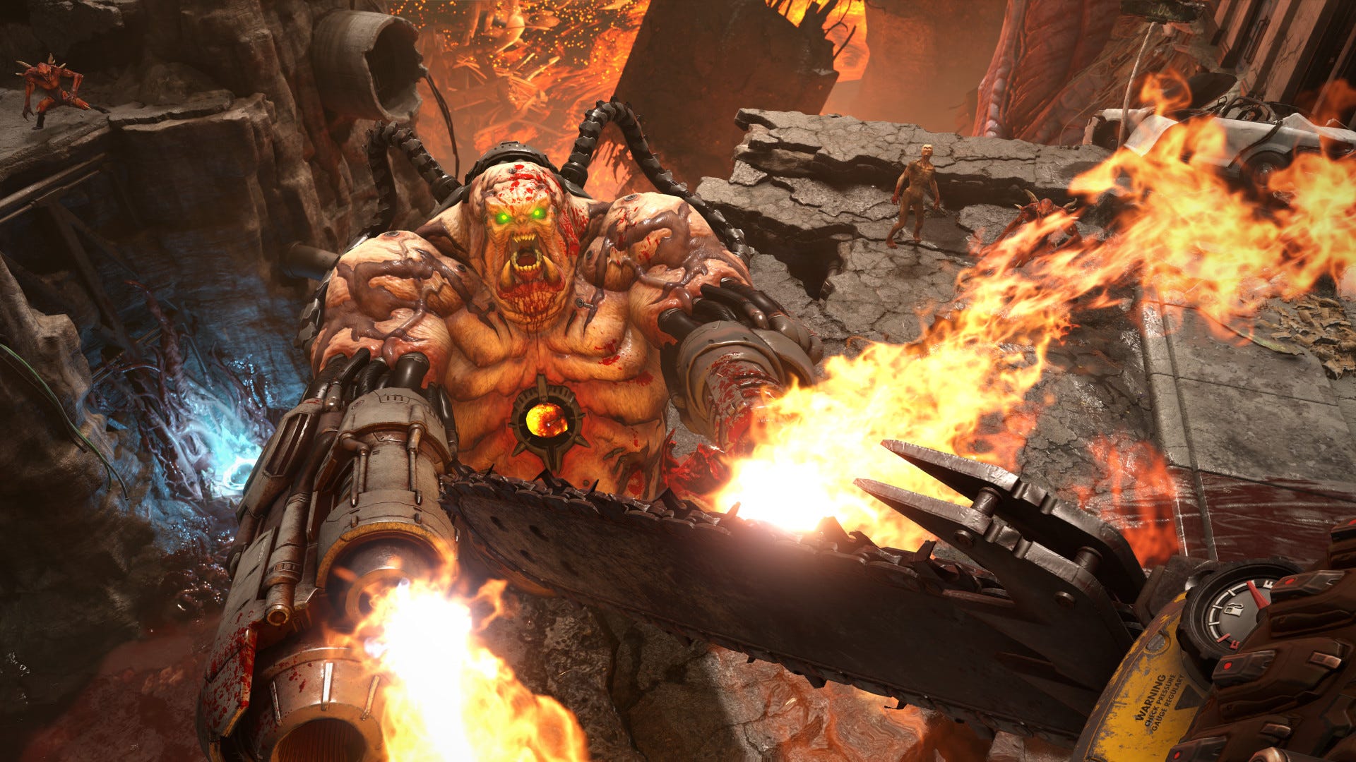
Doom is one of the best examples of employing unresolved tension in its screenshots. In almost every one of them, you can’t help but sit, stare and wonder “What’s going to happen next?”


Bonus Round: What Not To Do
Some crimes against screenshot-taking are so egregious they deserve their own warning section:
"This screenshot is from alpha footage." If your excuse is already in the caption, just wait until you have a better shot.
Empty, lifeless worlds. Unless your game is literally about a post-apocalyptic void, make sure your environments have life and movement.
Generic action shots. If someone can’t tell what your game is about just from the screenshot, you need a better one.
Conclusion: Screenshots That Sell
Great screenshots don’t just look good - they tell a story, build tension, and set expectations. They make people want to click "add to wishlist" because they need to see more.
Now go forth and make your game look like the masterpiece it is. Just...maybe double-check that no one’s clipping through the floor first.